Email: gm@indianbarcode.com / newdelhiprintersdwarka@gmail.com
Phone: +91-9717122688 / +91-9810822688
Email: gm@indianbarcode.com / newdelhiprintersdwarka@gmail.com
Phone: +91-9717122688 / +91-9810822688
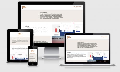
Today’s definition of “user-friendly†web design encompasses far more than the traditional components of pleasing aesthetics, a favorable arrangement, clear content and high-quality images. A website that’s truly user-friendly is now one that’s comprehensively responsive, which means that its layout is coded to provide an optimal viewing experience on any platform, be it an iPad, smartphone or other portable device.
A responsive website affords viewers the same user experience on a smartphone or tablet as it does on a traditional desktop, and actually works to provide enhanced navigation and features that are specifically designed for mobile or tablet use. A responsive website ensures: proper formatting for screens of any size, optimal image resolutions, adaptive media queries and use of the same URL on all devices.
Optimized website accessibility across platforms isn’t just advantageous;
it’s now actually a necessity for keeping a competitive edge in the realm of
internet marketing. In fact, responsive website design is increasingly becoming
the standard in internet marketing strategy, rather than the exception. The
reality is that if your company’s website isn’t specifically designed for
responsiveness, it’s likely providing users that access it from alternative
devices a less-than-desirable experience, which results in less traffic and
significantly fewer conversions.
In Fact studies indicate that when smartphone or tablet users open a
webpage that is poorly optimized, 40 percent will leave the site immediately
and visit a competitor’s site. What’s more, almost 70 percent of tablet users
purchased a product or service on their mobile device within the last month,
and mobile and tablet traffic continues to make significant gains each year
(and is expected increase tenfold in the next four years). Currently, mobile
and tablet usage accounts for approximately 40 percent of all online traffic;
this means that nearly half of all consumer browsing is conducted on a platform
other than a desktop. And, if you’re a small business or a company seeking to
boost its local SEO, know that more than half of all searches are performed on
mobile devices.
So we know that there’s a thriving mobile market, but how do we know
that responsive website design is the key to securing sales? The proof can be
found in the numerous case studies from companies employing responsive website
designs that have benefited from significant ROIs. For example, one clothing
company was able to increase conversions by 65% from iOS users and an
astounding 402% among Android users, while another photography merchandiser
witnessed a nearly 200% increase in total revenue after making their site more
accessible to mobile users, who actually only contributed 13% of their total
traffic. In general, a responsive website design has been shown to lead to
impressive gains in overall website traffic and conversion rates, regardless of
the size of the company or its current percentage of mobile users.
Our expert design team can optimize any company’s existing website for
responsiveness in just three easy steps:
1.   We’ll
make your website responsive without changing any existing elements or content
on your site. That’s right; with New Delhi Printers responsive website design
services, your website can remain exactly as is in terms of overall design
concept and content. We simply enhance what’s currently there for a better user
experience.
2.   We’ll
only need to conduct back-end coding, which allows us to make changes through
your server, application or database rather than the front-end elements that
users directly interact with.
3.   We
also guarantee an enhanced viewer experience; our team of design experts
ensures that a website’s layout is not only properly fitted to a variety of
platforms, but that it actually contributes a visual aesthetic equal to an
existing desktop website design.
·        Affords clearer viewership for mobile,
desktop and tablet users.
·        Allows companies to retain a single website
design and content, as there’s no need to create separate websites for each
platform.
·        Helps businesses reach more viewers, generate
more leads and achieve higher conversion rates.
May significantly improve your SEO ranking. Google
openly recommends responsive website design and prefers mobile-responsive sites
when generating search results on mobile devices